In the 1950s and 60s, one record label stood “like a beacon,” writes Robin Kinross at Eye, among a host of Civil Rights era independents that helped jazz “escape the racial-commercial constraints applied by White Americans, and find its own place, unpatronised and relatively free of exploitation.” That label, Blue Note, ushered in the birth of the cool—both cool jazz and its many hip signifiers—as much through graphic design as through its meticulous approach to recording.
Blue Note album covers may seem principally distinguished by the photography of Francis Wolff, whose instincts behind the camera produced visual icon after icon. But the label’s style depended on the layout, graphic design, and lettering of Reid Miles, who drew on minimalist Swiss trends in “over 500 album covers for Blue Note Records,” designer Reagan Ray writes. “He pioneered the use of creatively-arranged type over monochromatic photography, which is a style that is still widely used in graphic design today.”
As we noted in a recent post on Blue Note’s legendary design team, Reid’s lettering sometimes edged the photography to the margins, or off the cover altogether. Jazz greats were given the freedom to create the music they wanted, but it was the designers who had to sell their creativity to the public in a visual language.
They had done so with distinctive typefaces before Reid, of course. But the art of lettering became far more interesting through his influence, both more playful and more refined at the same time.
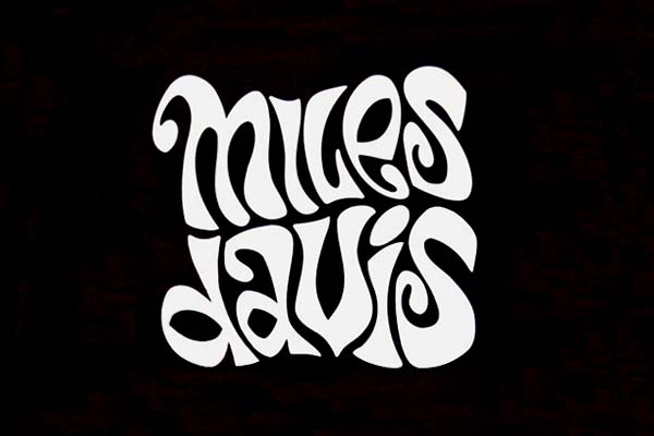
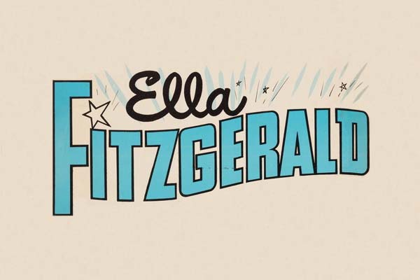
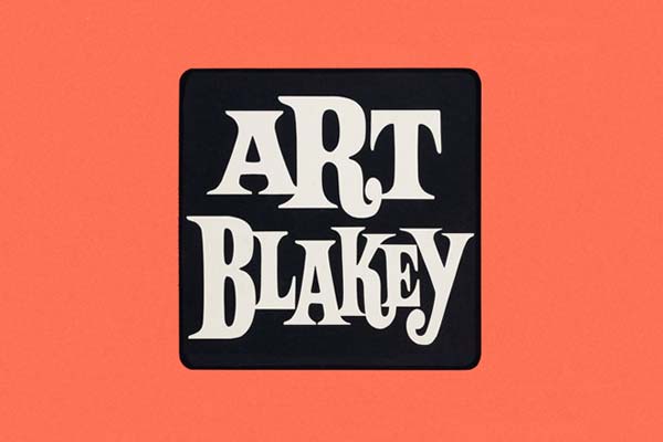
Since typeface has always played a significant role in the music’s commercial success, Ray decided to compile several hundred samplings of album lettering of jazz musician’s names, “for easy browsing and analysis” of typeface as an essential element all on its own. The gallery may attempt “to cover most of the genre’s significant musicians,” but there are, Ray admits, many inevitable omissions.
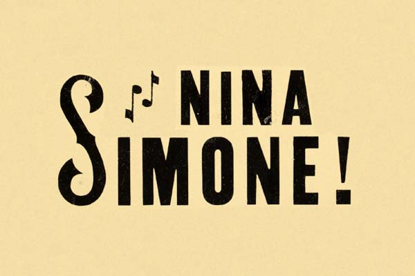
Nonetheless, it’s a formidable visual record of the various looks of jazz in lettering, and the visual identities of its biggest artists over the course of several decades. Ray does not name any of the designers, which is frustrating, but those in the know will recognize the work of Reid and others like album cover pioneer Alex Steinweiss. You may well spot lettering by Milton Glaser, whom Ray previously covered in a huge curated gallery of the famous designer’s album art.
The names behind the big names matter, but it’s the musicians themselves these individualized typefaces are meant to immediately evoke. Consider just how well most all of these examples do just that—representing each artist’s music, period, and image with the perfect font and graphic arrangement, each one a unique logo. Somewhat like the music it represents, Ray’s gallery is, itself, a collective tour-de-force performance of visual jazz.
Visit Ray’s gallery here.
Related Content:
Classic Jazz Album Covers Animated & Brought to Life
The Groundbreaking Art of Alex Steinweiss, Father of Record Cover Design
Josh Jones is a writer and musician based in Durham, NC. Follow him at @jdmagness
Jazz Typefaces Capture the Essence of 100 Iconic Jazz Musicians is a post from: Open Culture. Follow us on Facebook, Twitter, and Google Plus, or get our Daily Email. And don't miss our big collections of Free Online Courses, Free Online Movies, Free eBooks, Free Audio Books, Free Foreign Language Lessons, and MOOCs.


